Ticketmaster: Score (iOS)

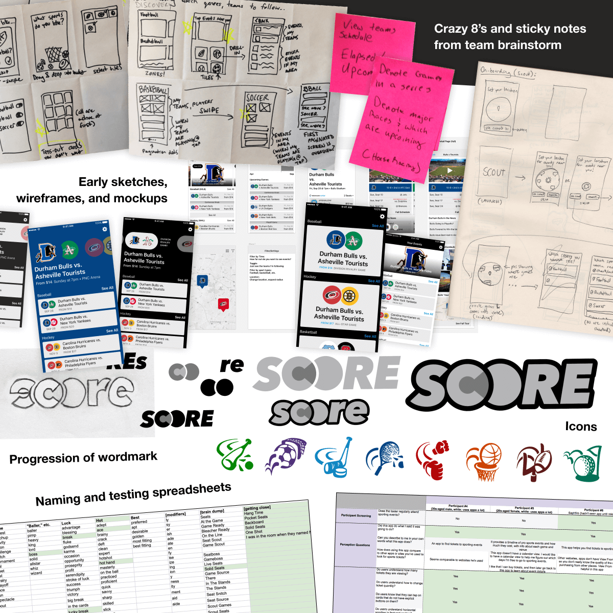
An app for the sports fans of Ticketmaster

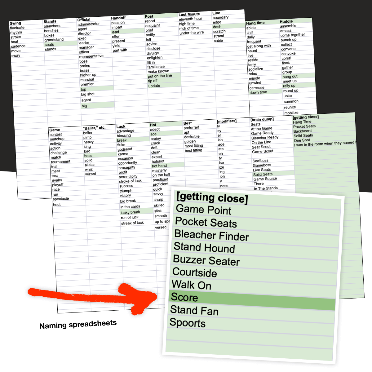
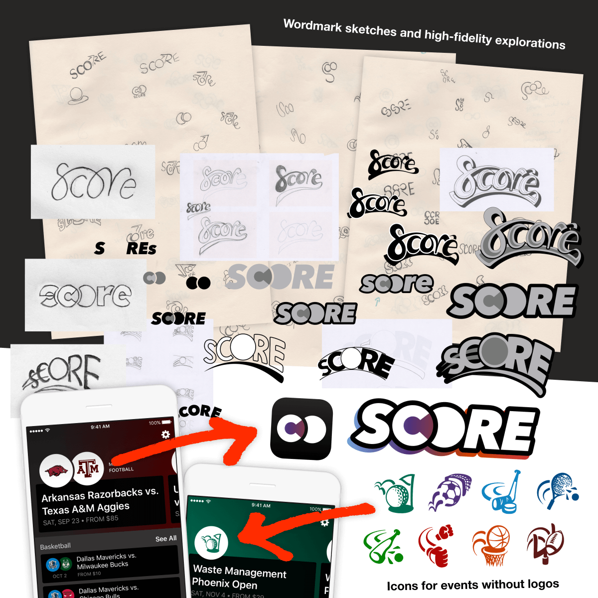
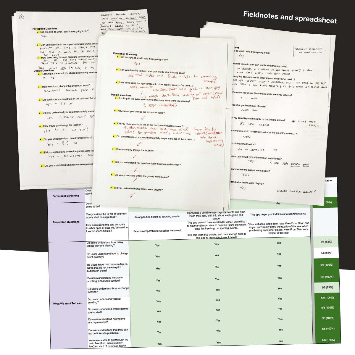
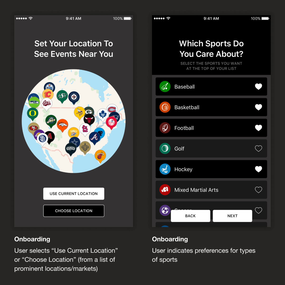
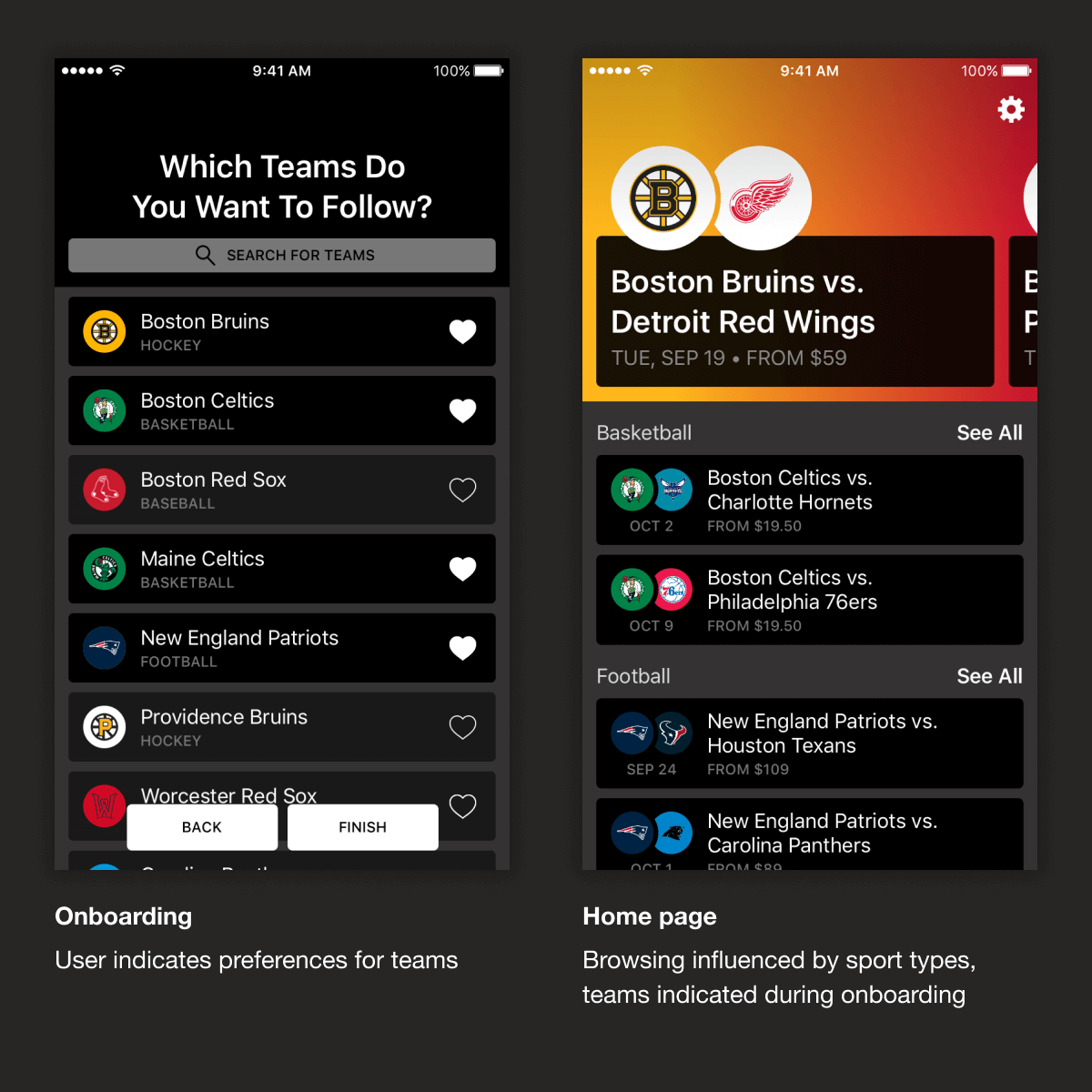
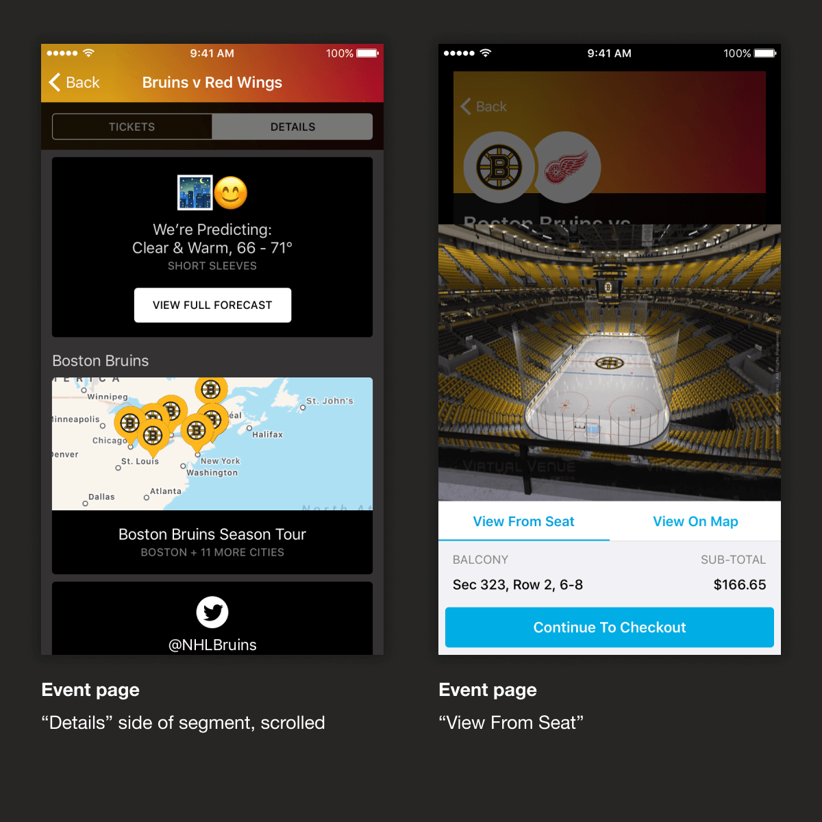
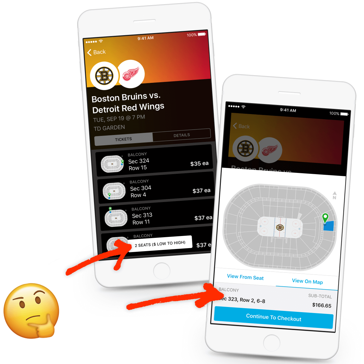
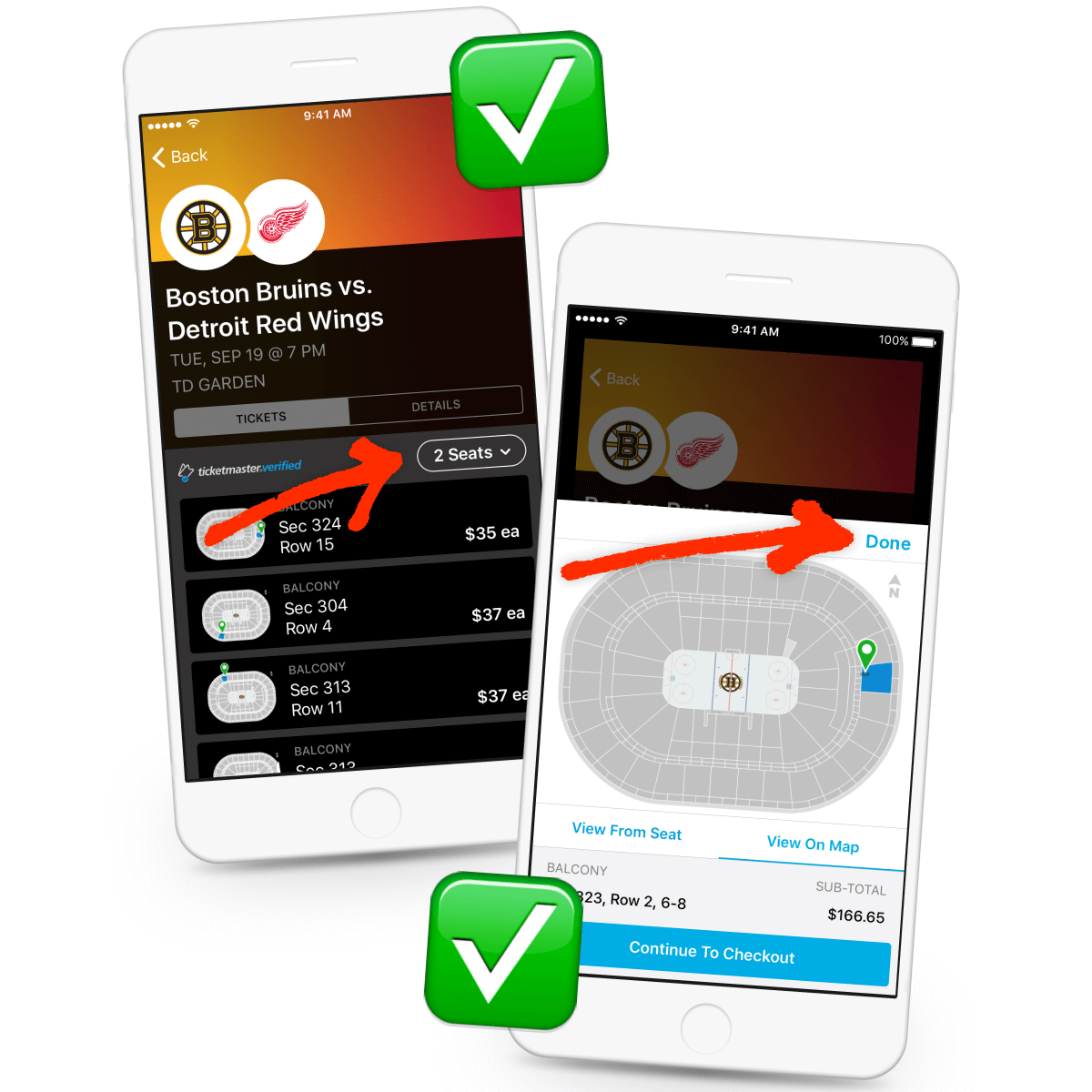
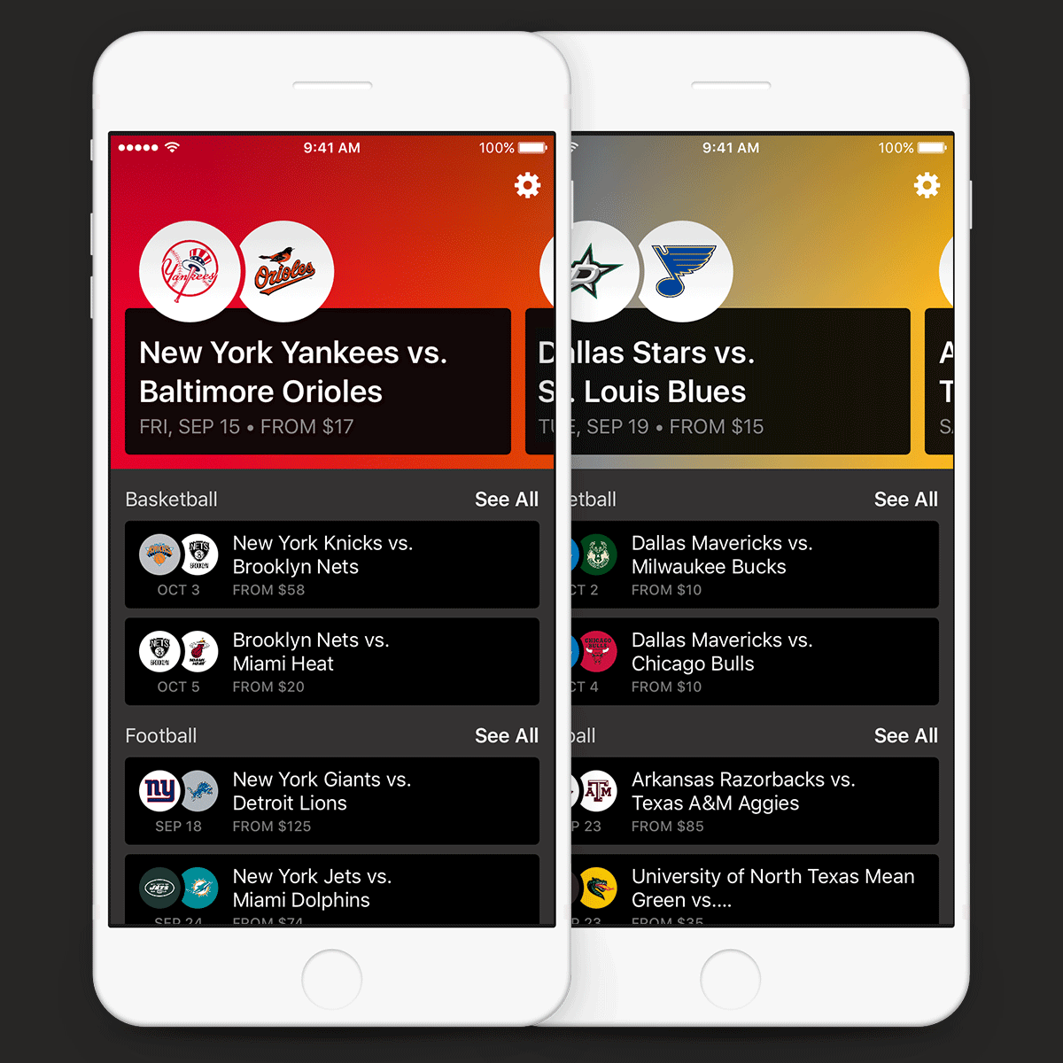
Need tickets to the big game? Score has you covered. With Score you can browse upcoming events, track where your favorite teams are playing, and purchase confidently with Ticketmaster’s verified guarantee. As the lead designer of the Score product, I was responsible for all aspects of its design including UX, UI, and brand identity. I also ran user testing and implemented changes to the product based on user feedback.

View PDF Version

Business/UX challenge
Ticket inventory to sporting events is going unsold.
Design a ticketing app for sports fans that demonstrates the value of purchasing tickets to sporting events so that less inventory goes unsold.
Team members, roles
Me - lead product designer
Peter Foti - lead developer
Brandon Houlihan - design manager
Tools used
Sketch, Principle, Illustrator
Timeline
Three months for MVP
My role
As lead product designer, I was responsible for all aspects of design:
I helped define the feature set for MVP (UX), designed for all use cases within the feature set (UX and UI), led workshops to determine the product’s name, designed all visuals including wordmark and icons (branding), and conducted usability tests of live builds.
Collage of crazy 8 sketches and sticky notes from group brainstorm; sketches, wireframes, and mockups from UI development; the progression of the Score wordmark; icons; naming and testing spreadsheets
Helping define features for MVP (UX)
To start things off, Peter, Brandon, and I brainstormed ideas for the product.
We asked questions like: What kinds of info would you like to see before buying tickets to baseball, hockey—even horse racing events? How would you visualize this info?
We wrote down every idea and then ran Crazy 8’s to visualize our ideas.
Collage of crazy 8 sketches and sticky notes from group brainstorm
Designing for all use cases (UX and UI)
Once we determined which features would be best and most feasible, I got to work designing them.
I translated our Crazy 8’s into wireframes, constructed user journeys around those wireframes, and used those wireframes and user journeys to design high-fidelity mockups for each screen within the product.
Collage of sketches, wireframes, and mockups from UI development
Leading workshops to determine product’s name
I sent out an open call to the office to help me brainstorm words related to sporting events. Then I went back to my desk to brainstorm words related to those words.
I then called the office back together to share the 100+ words I had gathered and asked them to help me pick some possible names for the product, eventually landing on “Score.”
Collage of the different spreadsheets used to brainstorm names for the product with arrow pointing to ‘Score’
Designing all visuals (branding)
I designed all brand materials for Score including its wordmark and app icon. I used sporting event aesthetics and team logos to explore letterforms, ultimately landing on a treatment that leveraged the double circle lock-up already so prevalent in the app.
I also designed the icons for events without logos.
Collage of sketches used to develop ‘Score’ wordmark as well as final Score wordmark and icon, and icons designed for events without logos
Conducting usability tests of live builds
Being a small team, we decided to test our product guerrilla style—by targeting people on the street.
We approached folks at the local mall, asking them to take a look at our app in exchange for free Starbucks gift cards.
We recorded our observations by hand and later transferred them to a spreadsheet for aggregation.
Collage of notes taken during testing observations and spreadsheet used to aggregate findings
Approach: In order to demonstrate the value of purchasing tickets to sporting events, we needed to first understand how sports fans ascribed value.
How many games are in each season of each sport? How does frequency/location effect interest? How do starting players or other highlights effect interest?
Questions like these drove our discussion around which features to develop.
The features we chose to develop demonstrated value in the following ways:
By asking users to share their locations and sports/teams preferences upon onboarding, we were able to show them more relevant information upon browsing.
By showing users “View From Seat,” “View On Map,” and other details (team season tours, weather predictions, etc.), we were able to get users more excited for events.
Two onboarding screens: ‘Set Your Location To See Events Near You’, where the user shares their location, and ‘Which Sports Do You Care About?’, where the user indicates preferences for types of sports
One onboarding screen: ‘Which Teams Do You Want To Follow?’ Also, an event page showing a list of ticket options for a hockey game
Two additional variations of the event page: the details segment, where team season tours and weather predictions are available, and ‘View From Seat’, showing what the vantage point for that ticket would be
One additional variation of the event page: ‘View On Map’, showing where the seats are on a venue map
Testing reinforced some assumptions...
Users successfully found events to buy tickets to.
Users found event details valuable.
Users found “View From Seat” valuable.
Users knew to scroll horizontally at the top of the home screen.
Users understood that events were populated based on the locations they set in onboarding.
...and challenged others!
Some users found the ticket quantity button at the bottom of the event page difficult to find, which made changing ticket quantity difficult.
Some users had difficulty dismissing the “pre-cart” bottom sheet.
Pointing out the ticket quantity button and the ‘pre-cart’ bottom sheet
Adjusting designs based on feedback
In response to testing, we moved the ticket quantity button above tickets and added a “done” button to all bottom sheets (if it can improve usability for one bottom sheet, it can improve it for all).
Through another round of testing, we found that 100% of users were able to navigate these updated screens without issue.
Pointing out how the ticket quantity button moved and how a ‘done’ button was added to the ‘pre-cart’ bottom sheet
Business goals met
At the end of three months, our team delivered an MVP that successfully demonstrated value and compelled its users to purchase tickets to sporting events (based on feedback from usability testing).
“A pretty cool app”
Feedback from users wasn’t only positive, it was enthusiastic.
We frequently heard things like “these details are cool,” or “‘View From Seat’ is cool; I would definitely buy these [tickets],” suggesting Score would make a viable e-commerce offering.
However, more testing would be required to determine this for sure.
Reflections, possible next steps
Usability testing proved to be invaluable to our process. Our team would have no insight into the success of our product without putting it in front of real people.
While the testing we did was great, more frequent testing earlier on in the process would have helped the product more in the long run.
Score home screen
Back Button

This site scrolls left-to-right!

Not a fan? No problem.

Just shrink your browser width to scroll vertically.

Dismiss