Print & Logo

Seventies-style typeface, ‘a’ character

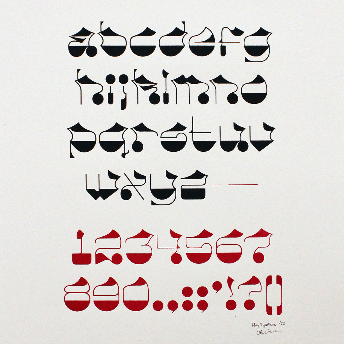
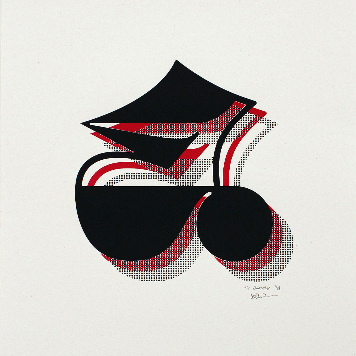
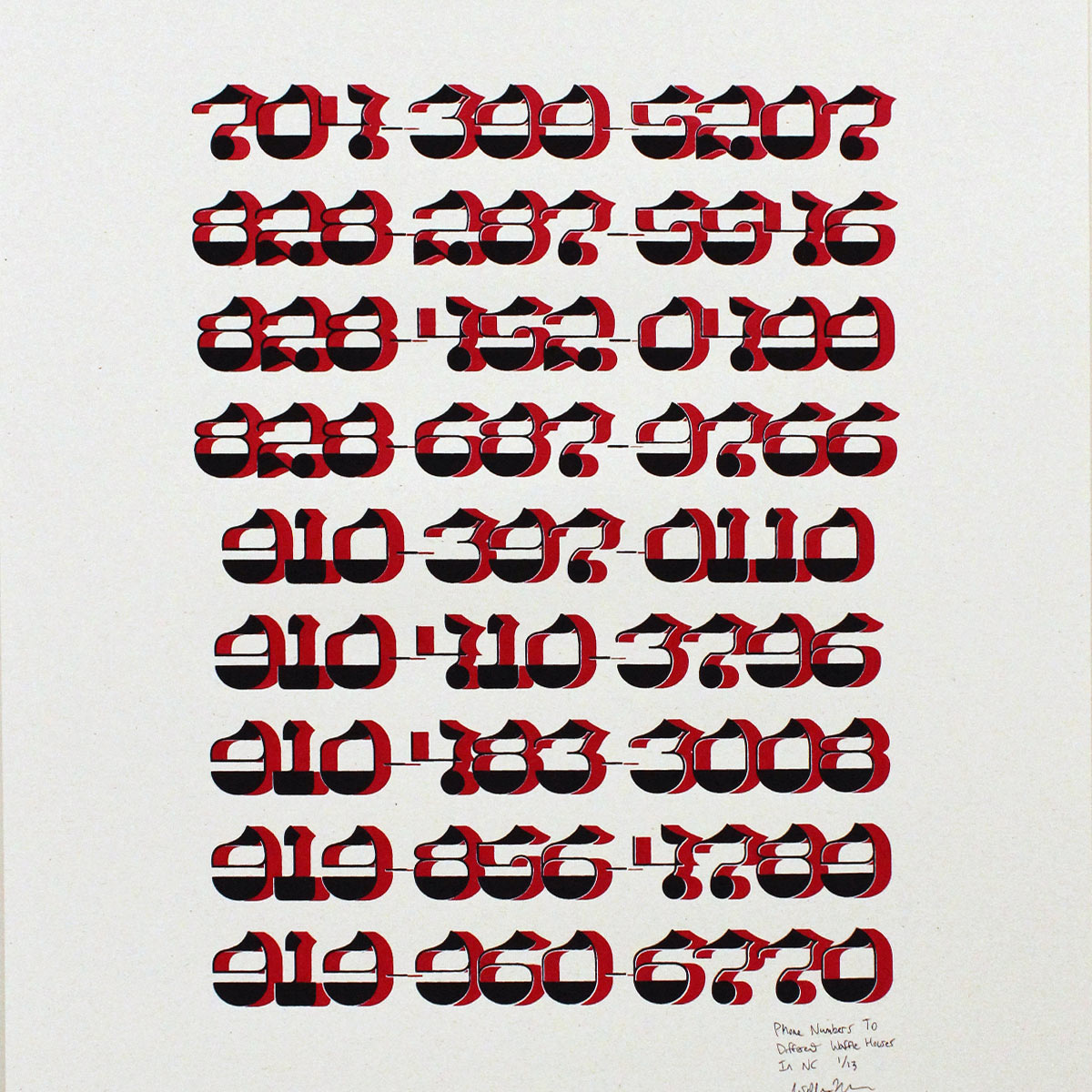
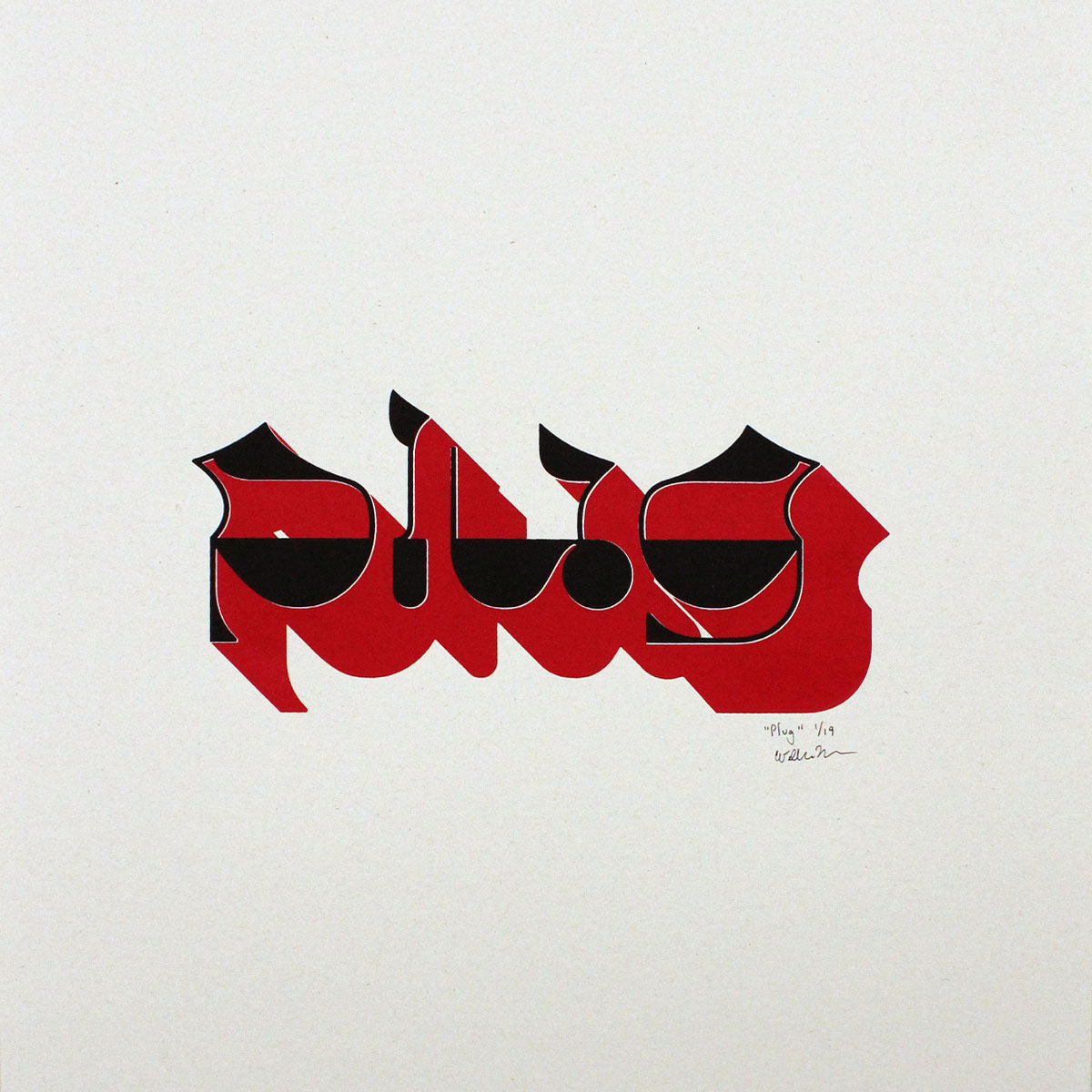
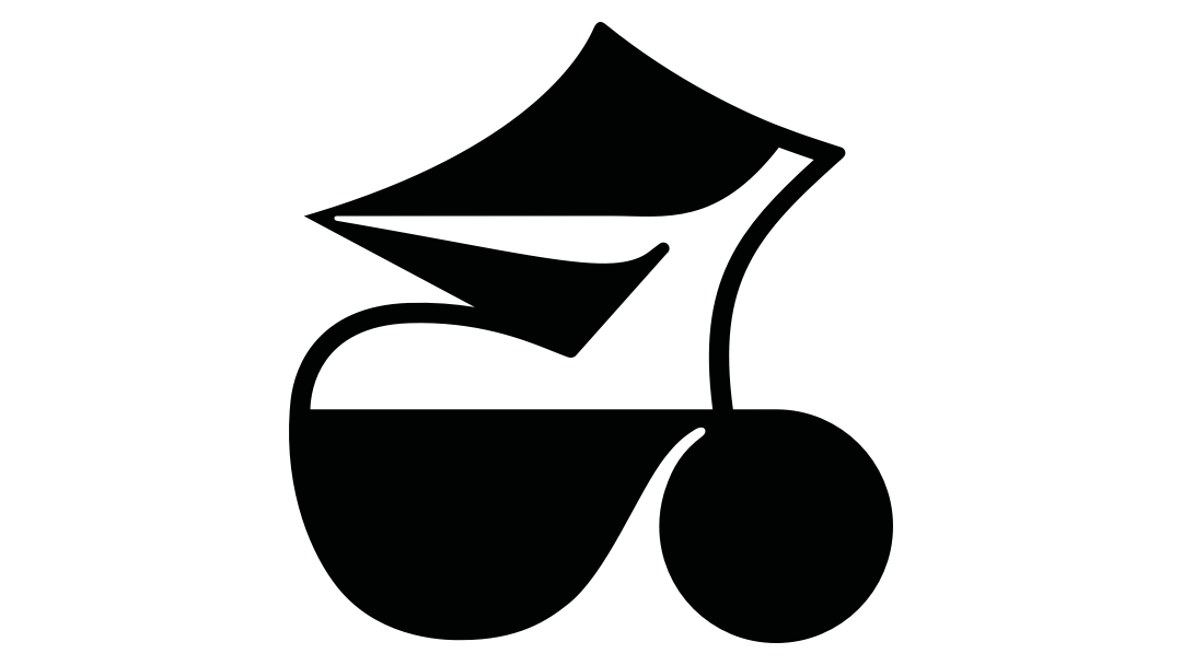
Plug Standard Typeface

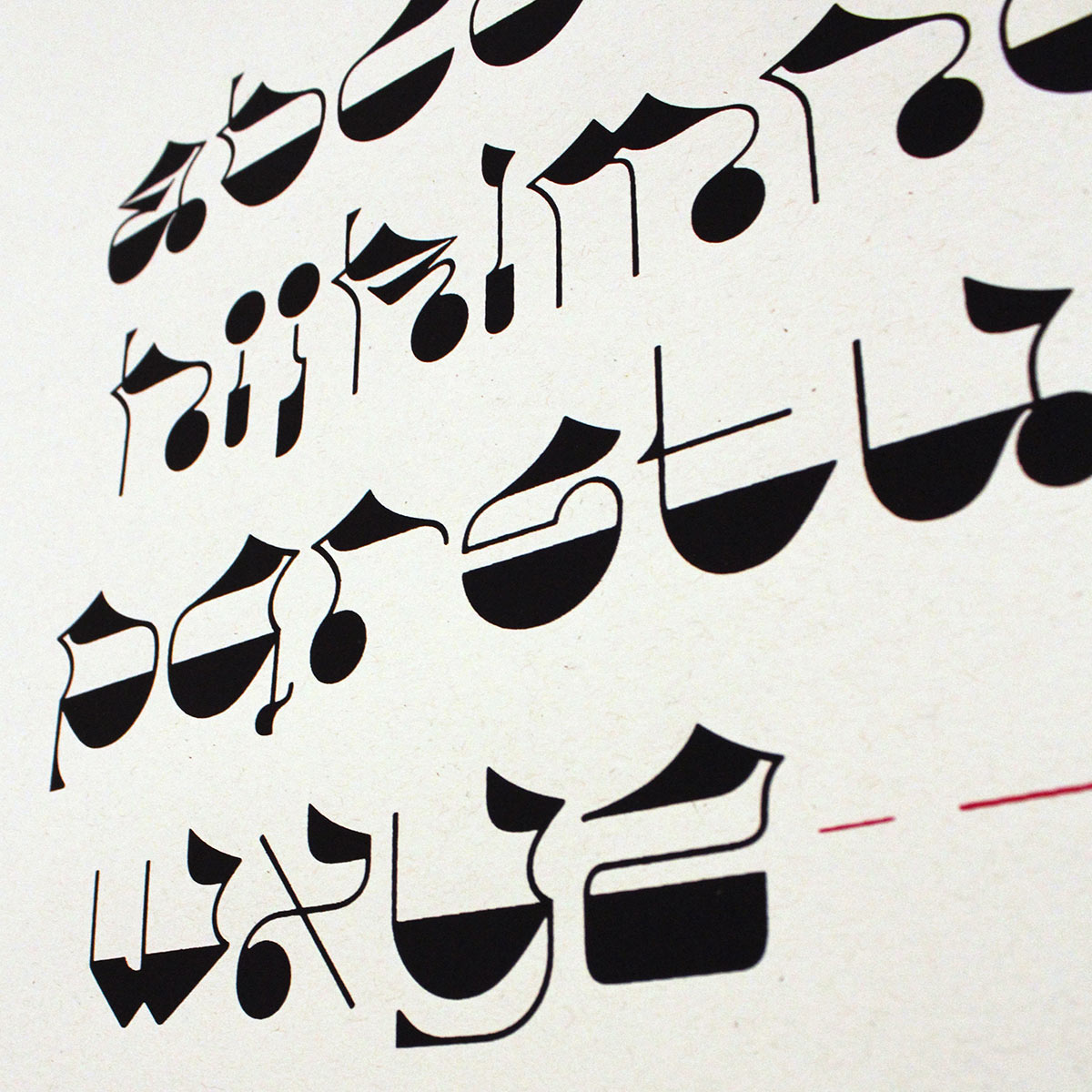
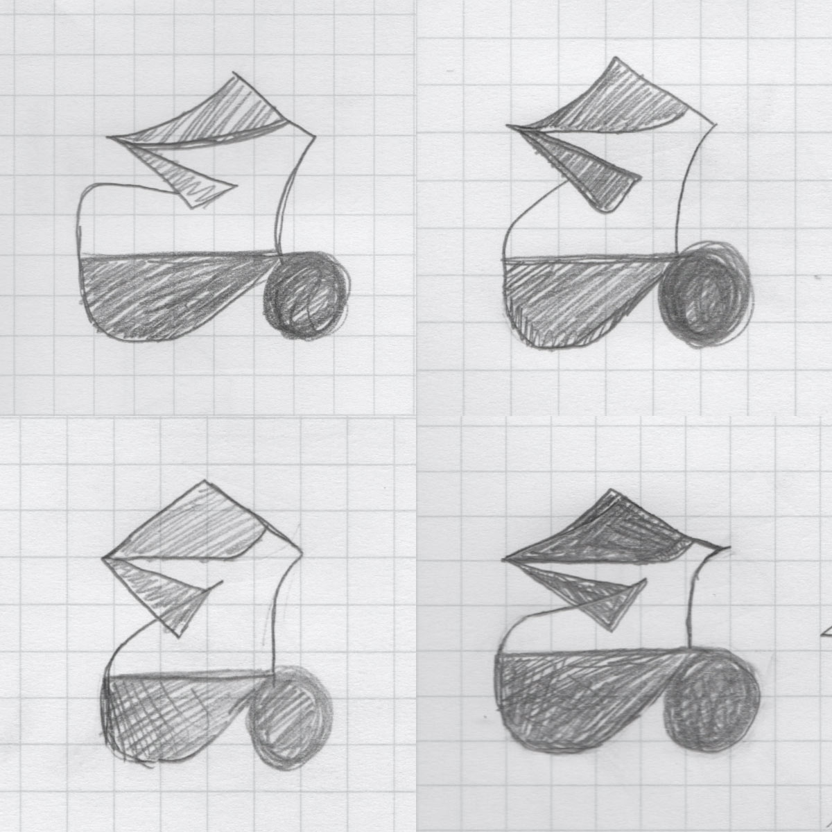
Designed with only lowercase forms in mind, this reverse-stress typeface was made to undermine the power of the uppercase. I took inspiration from seventies style typography as well as textura quadrata (gothic blackletter), ultimately creating a system that fulfills the extreme nature of reverse-stress while also introducing something entirely new. Represented firstly is the "a" character, the form of which heavily influenced the rest of the typeface.
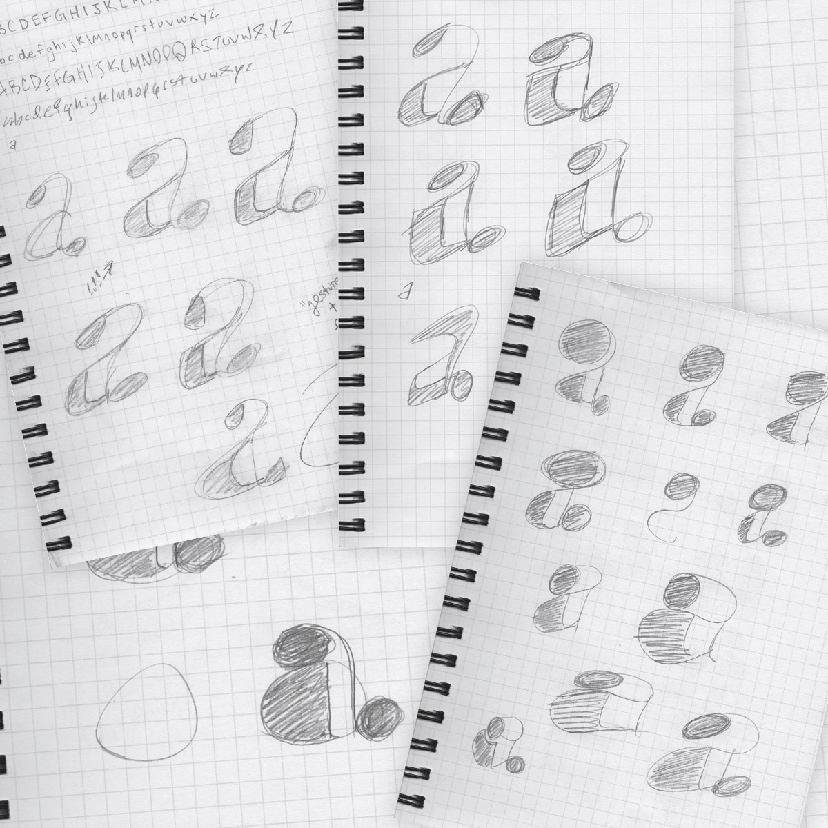
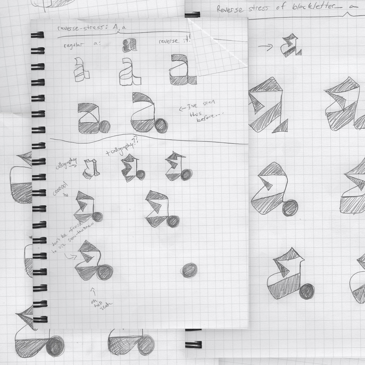
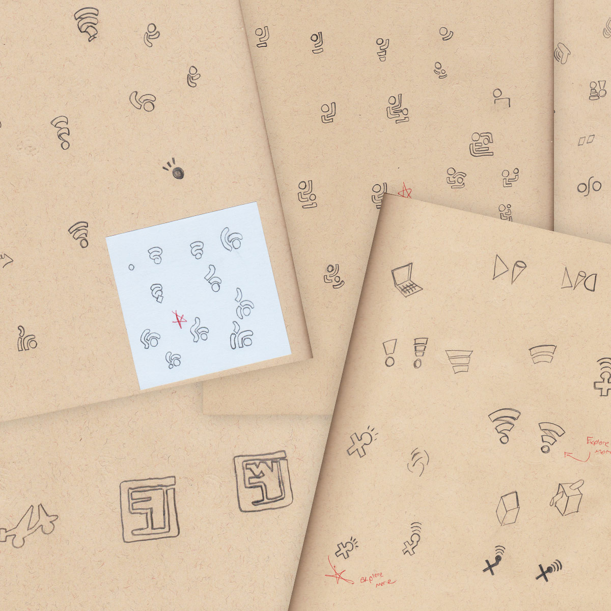
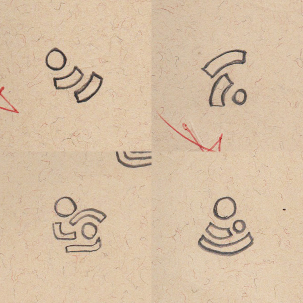
View Sketchbook

Screen printed poster of the entire typeface, ‘a’ through ‘z’, 0 through 9, and some special characters
Detail shot of screen printed poster
Early sketches of ‘a’ character
More developed sketches of ‘a’ character to show progression
Nearly final sketches of ‘a’ character to show progression
Screen printed poster of ‘a’ character to show final product
Screen printed poster of phone numbers to show typeface in context
Screen printed poster of the word ‘plug’ to show typeface in context
Optical illusion illustration in the shape of a ‘p’ character

Political Concepts Graduate Student Conference Poster

As a designer (and one with a master’s in anthropology, no less), I have a complicated relationship with theory. On the one hand, theory is magnificent in its ability to inspire new ways of thinking. It can help answer essential questions and uncover new ways of understanding and approaching design challenges. On the other hand, it can also distract from practical applications by focusing too much on abstract ideas. In designing this poster, I chose to exploit theory’s tendency to prioritize abstraction by rendering something else difficult to understand: the “impossible” p.

Political concepts conference poster showcasing optical illusion ‘p’, on a light background
Political concepts conference poster showcasing optical illusion ‘p’, on a dark background
Political concepts conference poster showcasing schedule, on a light background
SafeTech Kids NC logo in blue

SafeTech Kids NC Logo

SafeTech Kids NC (initially called “NC SafeTech 4 Kids” before the design effort) is a regional nonprofit that works to inform North Carolina parents of the potential risks of wifi radiation. Despite the seriousness of the topic, I felt it was important that the brand feel positive and optimistic. Drawing inspiration from the wifi symbol, I remixed its form to create something that felt bright and fun to celebrate children’s health and playfulness.

View Presentation Deck

SafeTech Kids NC logo with text on a business card mockup
‘I’m a SafeTech Kid, Parent, or Teacher’ campaign mocked up on stickers
Early sketches of logo
More developed sketches of logo to show progression
SafeTech Kids NC logo with text
‘Appalachia’ styled as ‘app-uh-latch-uh’ and mocked up on a sticker

Say it with me: “App-uh-latch-uh”

Pronunciations reflect culture; they embody ways of being. In the southern part of the Appalachian mountains, how one pronounces the word “Appalachia” is noticeably different from pronunciations in other parts of the country. This region has long been the destination for tourists interested in its scenery, but only recently has it seen these visitors come to stay, a result of the ability to work from anywhere that the digital age affords. I designed this sticker to address this influx of visitors, making visible an important aspect of culture that would otherwise go overlooked.

‘App-uh-latch-uh’ sticker stuck on the back of a red pickup truck
Back Button

This site scrolls left-to-right!

Not a fan? No problem.

Just shrink your browser width to scroll vertically.

Dismiss