Narrative Signage

Photograph of a vernacular sign on a city street

Paying attention to the signmaker behind the sign

The modern approach has stripped design of its idiosyncrasies. Gone is the human touch, of understanding that there is someone on the other side navigating important decisions about how best to realize their creation. As a result, we yearn for design’s uncommon features: its odd, its unusual—its vernacular. This project seeks to analyze vernacular signs with a particular focus on the characteristics that give insight into the creative process.

View On Instagram

Car wash sign where the words ‘jet spray car wash’ have all faded and someone has painted in certain letters so that the sign now reads ‘pray’
Breakfast sign with an arrow facing right where ‘breakfast’ is written across the top and bottom but flipped over on the bottom so that if the sign were turned 180 degrees it would still be readable

There is much one can infer from these characteristics—from the signs telling stories about how they were made.

Most signs require thoughtful deliberation to communicate effectively: how to articulate their message, how to compose it, when and how to maintain versatility, etc. But it’s vernacular signs that inscribe these decisions onto the canvas itself, revealing the unique challenges of each sign and how their signmakers chose to address them.

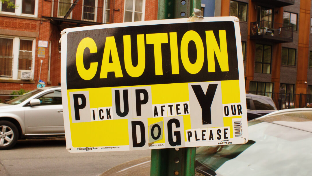
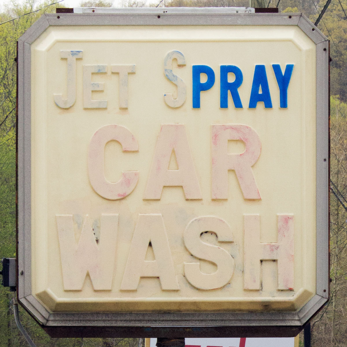
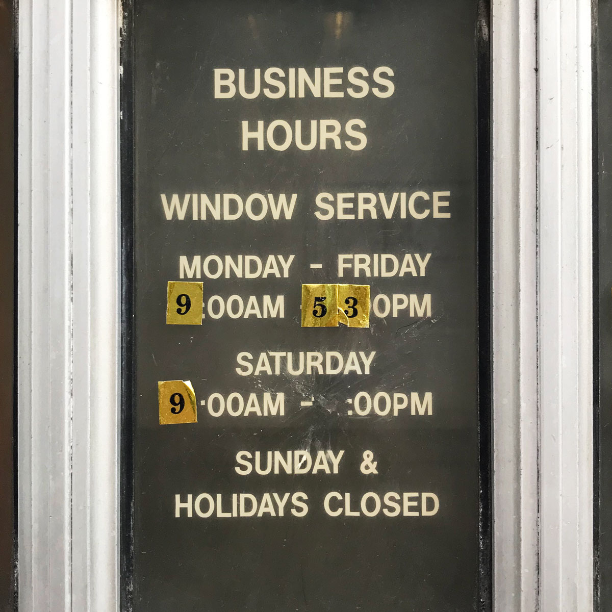
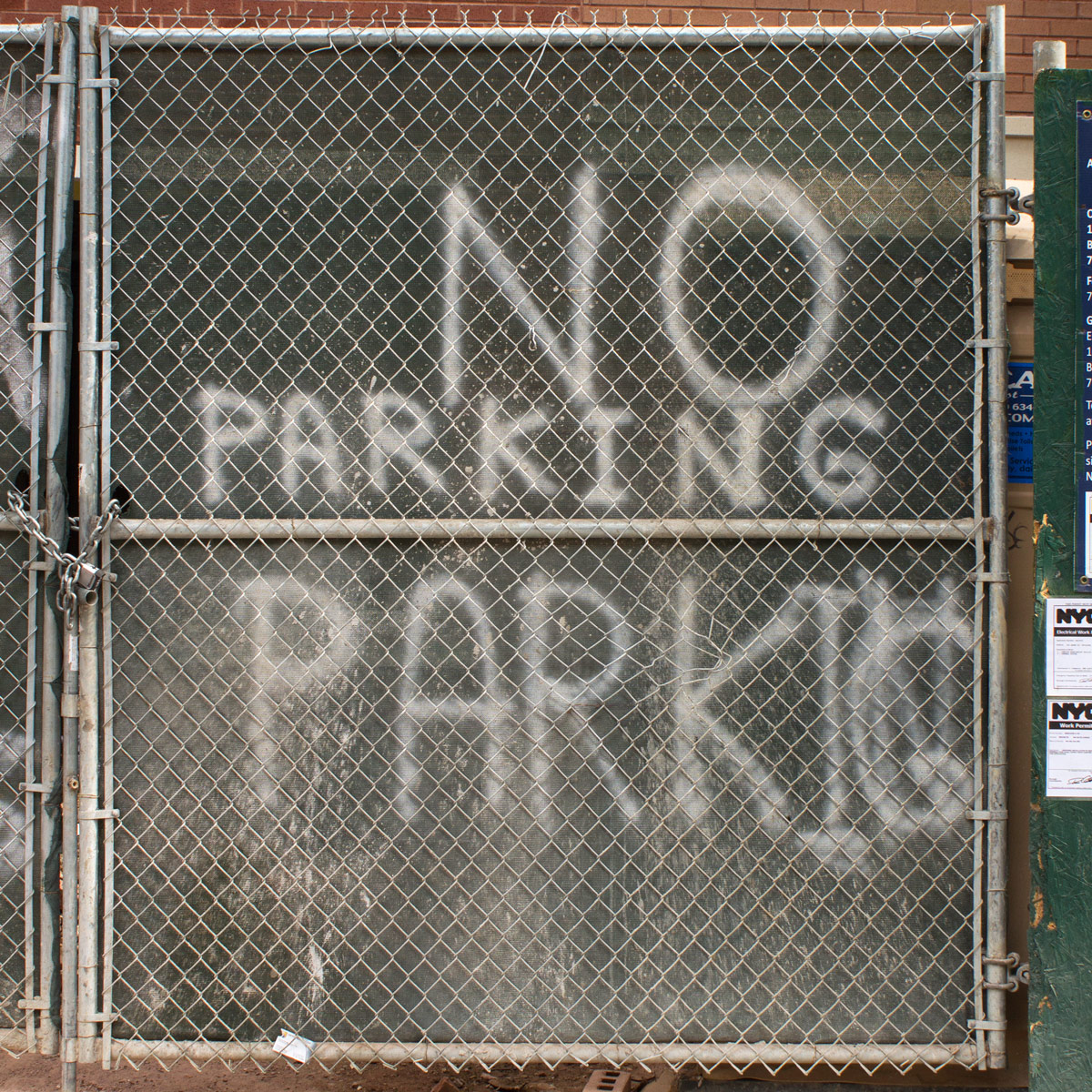
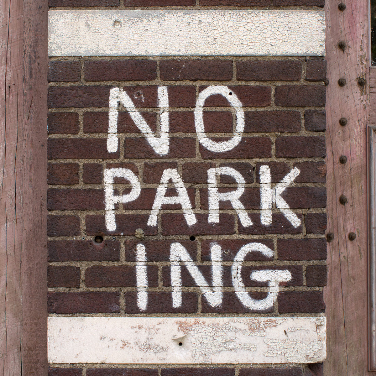
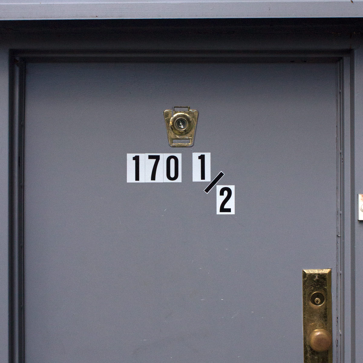
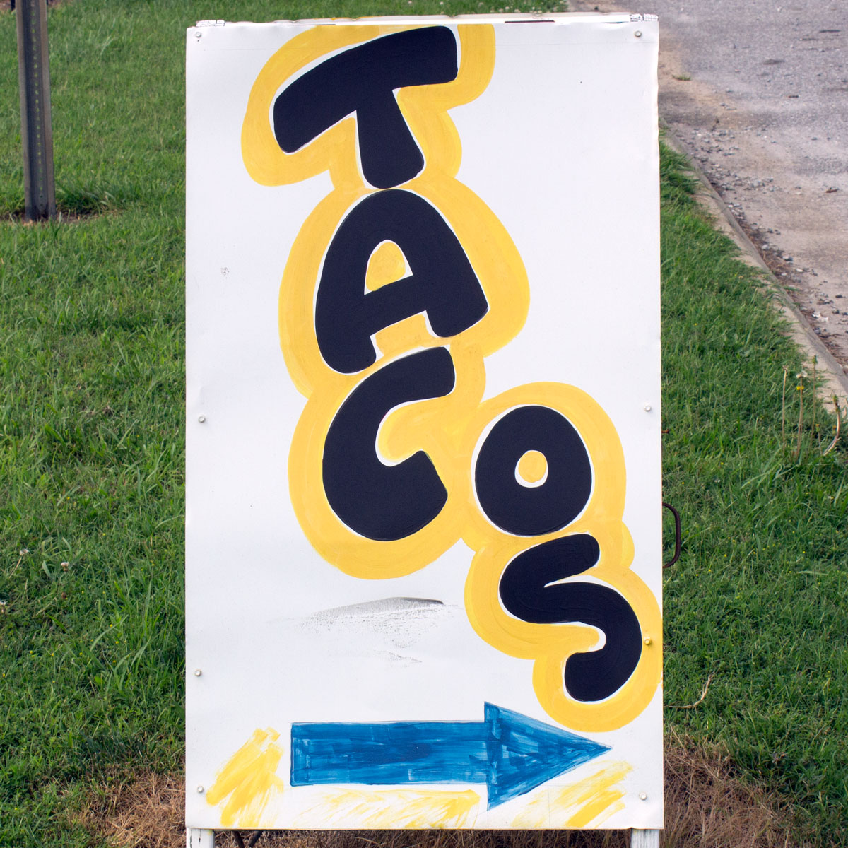
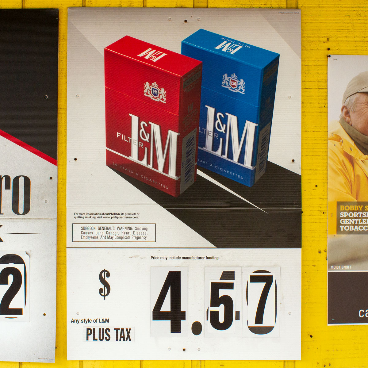
Because vernacular signmakers typically work with their hands, they don’t have the luxury of using “Command+Z” nor can they resize elements once they realize they’re too big or too small. Instead, they must respond to these issues on the fly. Much of how they respond can be inferred by paying attention to the inscriptions on the sign, such as when the word “parking” or “tacos” proves to be too long and the signmaker must figure out where to place the remaining letters. In addition, vernacular signs can also reveal the more practical aspects of signmaking, such as when the hours of operation or price of cigarettes change (but the change isn’t significant enough to justify the creation of a whole new sign).

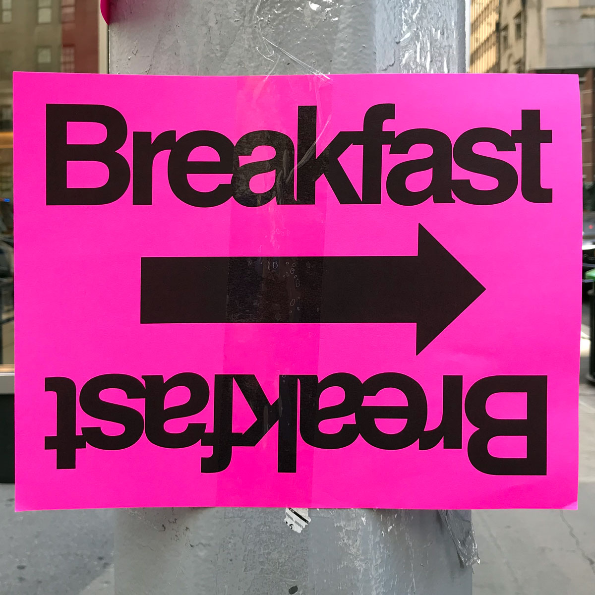
When these signmakers do have the luxury of designing with software, such as with the pink “breakfast” sign, what can be inferred is different but still rich. This sign reveals not only how volatile the location of breakfast for these events actually is, but how the signmaker must respond to this volatility. Instead of printing different signs with arrows facing different directions, why not print one sign that can be spun around?

Business hours sign where numbers have been scratched off and replaced with stickers with numbers on them
Church service sign where ‘8:30’ has been taped over and ‘10:00’ has been painted over so that it now reads ‘11:00’
Spray-painted ‘no parking’ sign where signmaker ran out of room and had to rewrite ‘parking’ a second time, above the first attempt and noticeably smaller
No parking sign where ‘park’ and ‘ing’ have been split up into two words and placed on separate lines so that they could be rendered larger to take advantage of the vertically-narrow space
Street sign that once read ‘Dale Dr’ but now reads ‘Dale Jr’ as a result of someone having placed a sticker with the letter ‘J’ over the letter ‘D’ in ‘Dr’
Street address ‘170 and a half’ placed on a door using the same-size numbers for the whole numbers as for the half-numbers
Sandwich board sign that reads ‘tacos’ spelled out vertically but with ‘o’ and ‘s’ placed to the right of ‘t’, ‘a’, and ‘c’
Cigarette advertisement where numbers indicating price have been pasted over with new numbers
Back Button

This site scrolls left-to-right!

Not a fan? No problem.

Just shrink your browser width to scroll vertically.

Dismiss